The Process of “Making It an Object” ②: Printing Techniques That Give Photographs DepthThe final stage in which the author's world and photographs become a physical object
「物に仕上げる」行程 ② 〜 写真に立体感を与える印刷技術 〜著者のもつ世界と写真が物になる最終行程

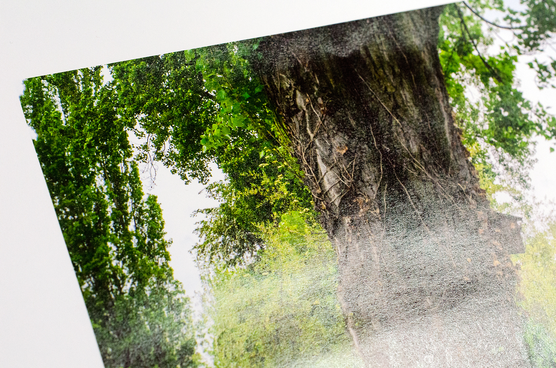
The photographic printing produced by Yamada Photo Process Co., Ltd. stands apart from ordinary work in the field. The photograph above is a close-up of an actual sample printed by the company during color proofing on the chosen paper. It was deliberately photographed to make the surface look rough, but in person the tightly rendered lines and rich, firm blacks make the print exceptionally beautiful. Above all, it has the dimensionality and depth of a photographic print. The apparently rough surface contains the expertise the company has built over many years.
株式会社山田写真製版所の手がける写真印刷は、世間の一般的なものと一線を画しています。上の写真は実際に同社で印刷された、本紙色校正の際のサンプルを接写してみたものです。この写真ではザラザラとした仕上がりに見えるようにあえて撮影していますが、実際は極めて緻密に描かれたラインに締まった黒が印象的で大変に美しい印刷です。なにより「写真プリント」として、立体的であり、奥行きを感じさせる美しさ。この一見ザラザラとした表面に、同社が積み上げてきたノウハウが蓄積されているのです。
Printing Direction That Gives Photographs Depth
写真に奥行きを与える、プリンティングディレクション
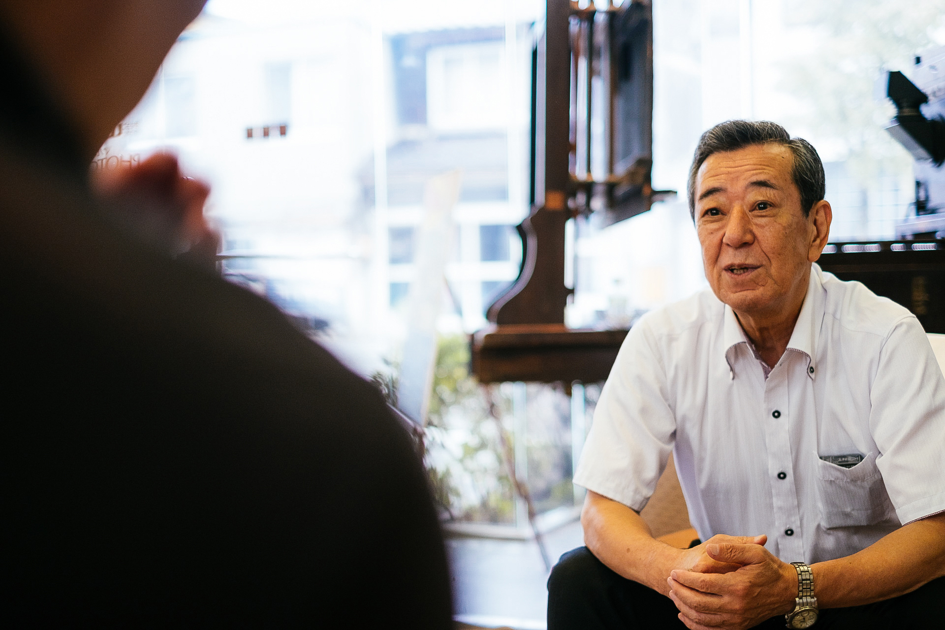
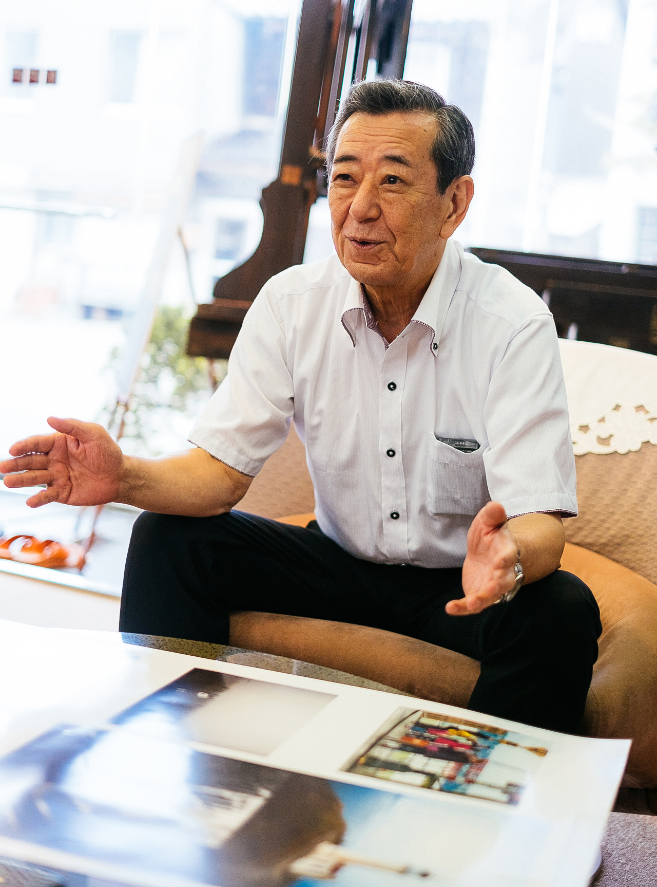
Keizo Kumakura is a printing director at Yamada Photo Process Co., Ltd. After serving for many years as a printing director at one of Japan's leading printing companies, his tireless pursuit of the craft brought him to his current role, where he also opens the field widely to train the next generation. Many prominent art directors, designers, and photographers place their trust in him. The printing he directs has, above all, a sense of depth. That quality is difficult to convey in words, but the comparison below offers an example.
株式会社山田写真製版所のプリンティングディレクタ(PD)、熊倉桂三さん。日本でも屈指の印刷所にて長年PDをつとめ、印刷への飽くなき探求心から、現在同社にてPDをつとめ、広く門戸を開いて後進の育成にあたっておられます。一線で活躍する多くのアートディレクタやデザイナ、写真家が信頼を寄せる熊倉さんが手がける印刷は、ともかく「奥行き」を感じるものです。これを言葉で伝えるのは難しいので、たとえば下のような違いです。
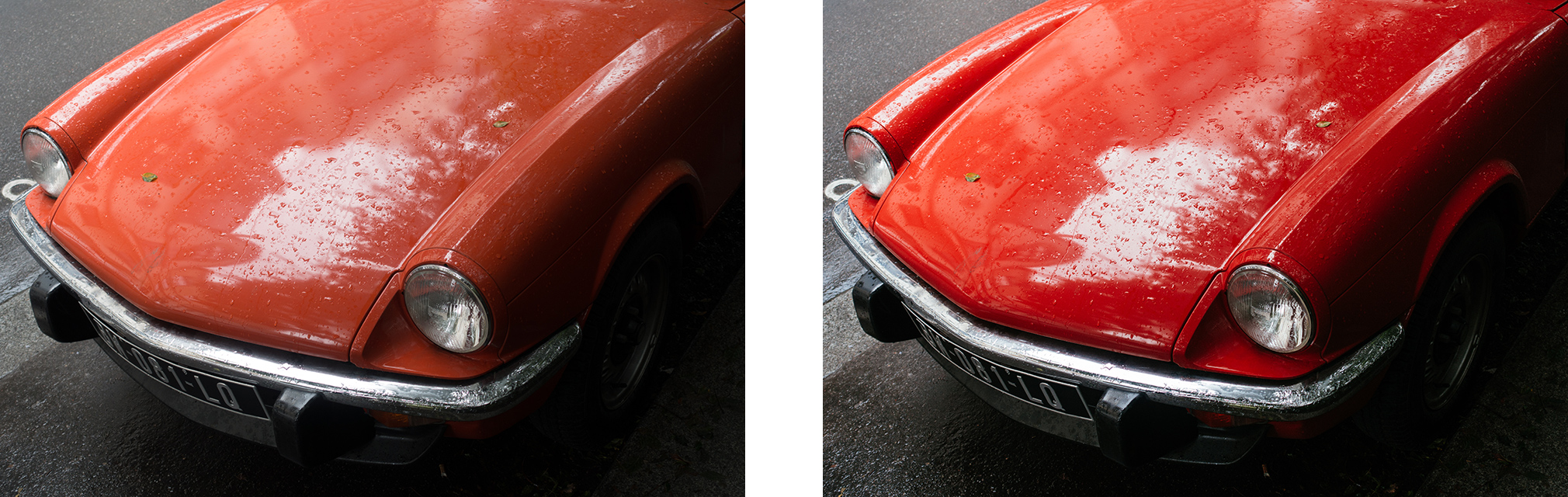
Leaving the intended color reproduction aside, the image on the right has greater contrast than the flat image on the left. Its shadow detail is not crushed, yet the shadows feel firm. The plated metal has clearer definition, and the luster of the painted surface and the character of the raindrops come through. We exaggerated the difference slightly for clarity, but the right-hand image conveys the impression of printing directed by Kumakura and produced by Yamada Photo Process. Have you ever obtained a result like the image on the left from an inkjet printer, even though you imagined something like the image on the right while editing? We will not delve deeply into that question here. What we want to convey is that Kumakura and Yamada Photo Process have a clear answer to how a photograph should be expressed. They will show the client a card one level beyond what was expected.
狙う色再現などはさておいて、左側の眠いカットに比べ、右側はコントラストがつきながらも、シャドーのディテールは潰れきってはなく、しかし引き締まっています。またメッキ部分のメリハリもつき、塗装面の艶やかさや雨滴の雰囲気も伝わります。少しわかりやすく極端に表現してみましたが、熊倉さんと株式会社山田写真製版所の手がける印刷は、右のカットのような印象なのです。そして、インクジェットプリントなどで左側のような仕上がりを経験したことはありませんか? それは仮に右側のカットのような雰囲気を編集画面上ではイメージしていたとしても。この件についてここであえて深く掘り下げた話はしません。ひとつ皆さんにお伝えしたいのは、熊倉さんをはじめ、そして株式会社山田写真製版所は、写真をどのように表現すべきか、そのことについて明確な回答を持っているのです。そして、依頼者に一枚上のカードを見せてくれることでしょう。
The Secret to the Beauty Lay in an Amount of Black Ink We Had Never Seen
見たことのない、盛られる墨(K)に美しさのヒントがあった
⑯ Color Proofing on the Chosen Paper
⑯ 本紙色校正
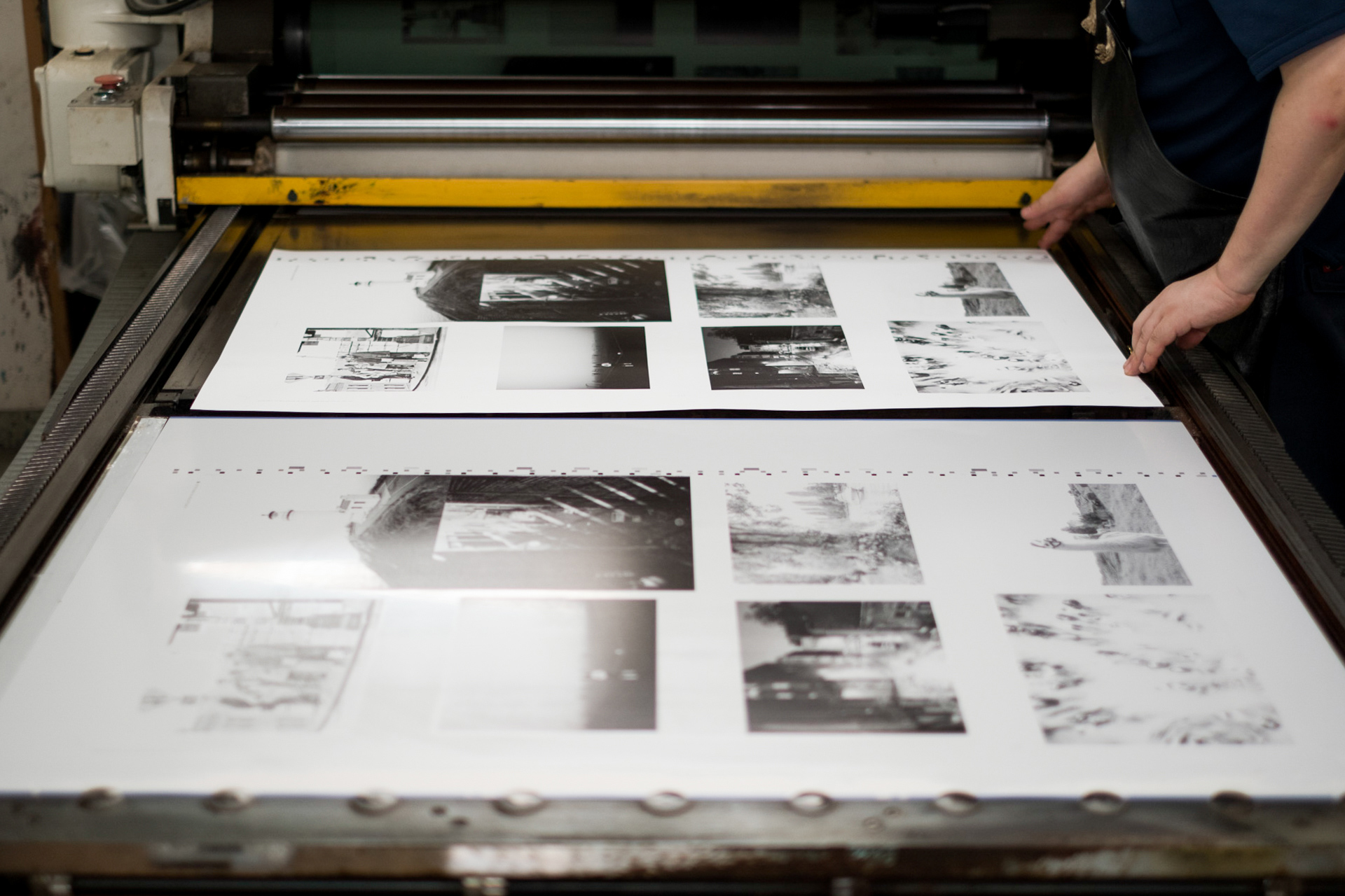
Because this was Scott's first experience with full-scale printing, we decided to make color proofs on the actual paper. Today, color proofing is often performed with a dedicated digital consensus proofing system, so opportunities to proof on the final stock have become rare. Even at Yamada Photo Process, a proof on the chosen paper is generally used only to confirm the paper and the character of the printing, while the final color decisions are based on a digital consensus proof. The production press is not used for this proofing stage; the plates are overprinted in KCMY order. What astonished us most during the press check was the K plate, the black plate. In ordinary color photography, black is generally not applied as heavily as it is above. There was enough information for the image almost to stand on its own as a monochrome photograph. That was the greatest surprise.
本格的な印刷は初めてというScott氏のために、実際に使用する紙を用いて色校正を行うことにしました。昨今は色校正も”デジコン=デジタルコンセンサス”専用機で行うことが多く、本紙を用いた色校正を行う機会が少なくなりました。株式会社山田写真製版所においても、本紙色校正を行ったとしても用紙や印刷の風合いを確認して貰うに留め、色味についてはデジコン出力されたものを参考に最終校正を行うそうです。本紙色校正では実際の本刷りで使う印刷機は使用せず、KCMYの順で各版を重ねていきます。立ち会ってなにより驚いたのは「K版(いわゆる墨版)」の様子。カラー写真の場合、一般的には上のようにKが盛られることはありません。モノクローム写真で成立しそうなほどに盛られています。このことに何より驚きました。
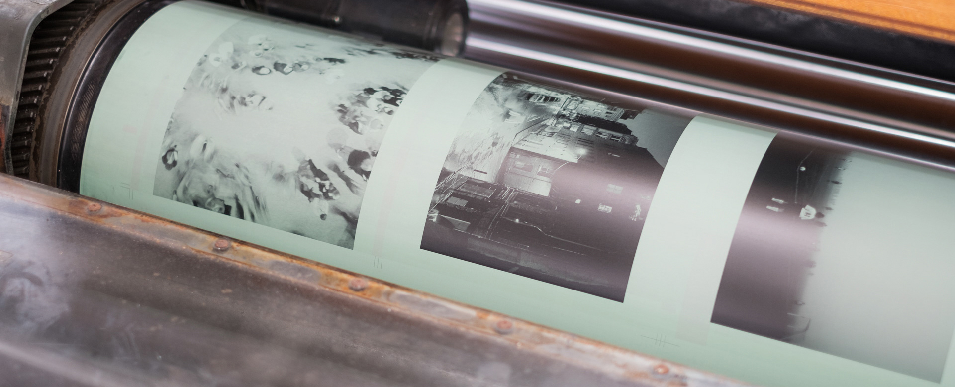
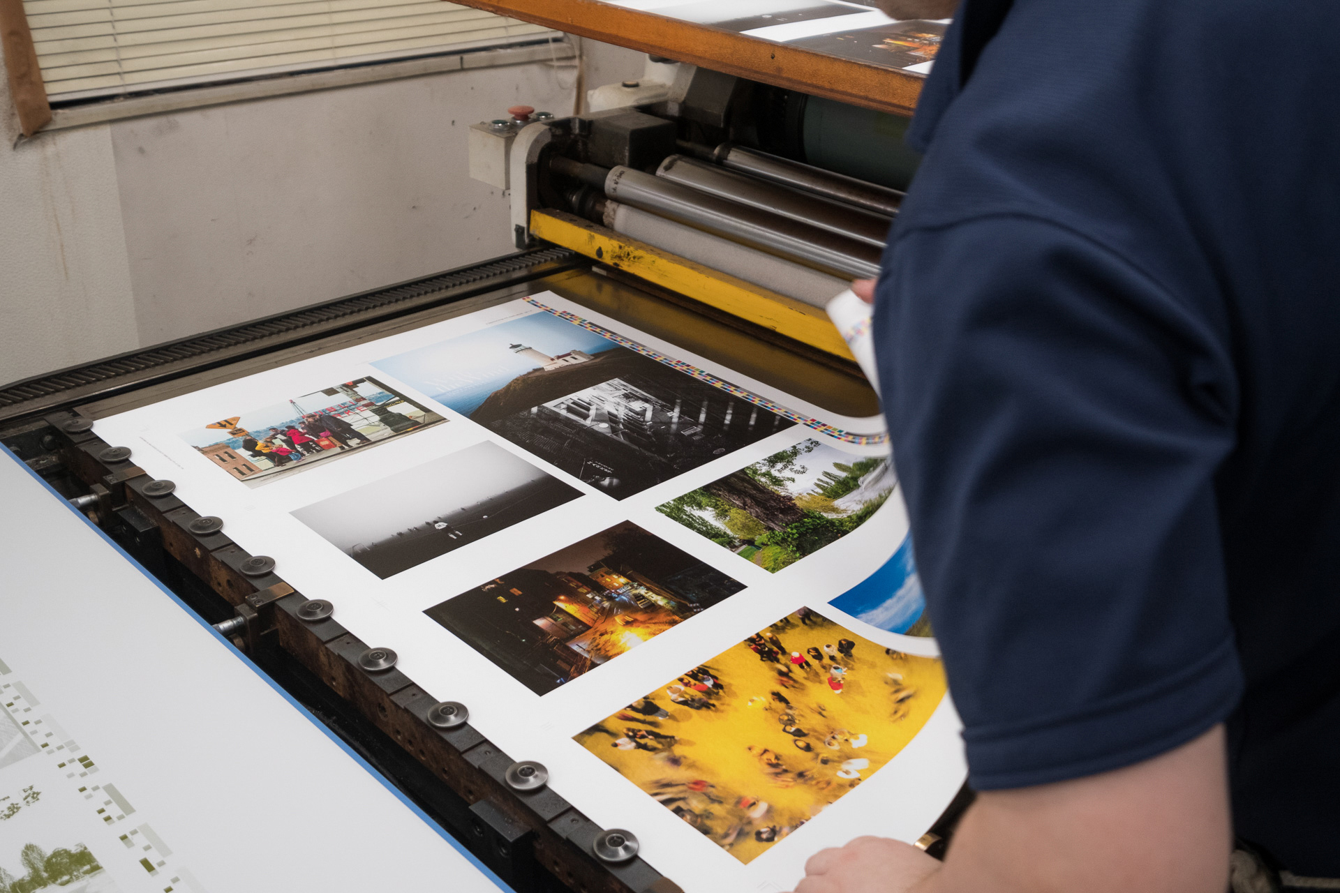
The image above is the K plate. In a typical plate, black is merely scattered through the frame. Yamada Photo Process's K plate, however, carries enough ink to stand on its own almost as a monochrome image. At left is the result after all four KCMY plates have been printed. In the lowest photograph, a yellow floor fills most of the frame, yet the K plate above shows that black ink has been applied even to that floor.
上がK版です。画面内にKが点在する、一般的にはその程度です。しかし同社のK版は、まさにモノクロームとして成立するほどにインクが載っているのがわかります。左がKCMY版すべてを刷り重ねた状態です。その中の一番下のカットは、黄色い床がフレームの大半を占めていますが、上のK版の様子を見ると、その床にでさえKインクは載っています。
Simply saying that more ink is applied understates the matter: adding ink is equivalent to adding risk. The sheets are more likely to rub against one another, so it is not easily achieved. Large quantities must be printed within a limited time. The result comes from bringing every factor in the process into alignment, finding a solution for color separation, platemaking, and press setup as precise as threading a needle, and accumulating the expertise to repeat it.
一言に「インクを盛る」といっても、それはリスクを盛る行為に等しいわけです。用紙同士の擦れなどが起こりやすく、そう簡単に実現できることではありません。限られた時間内に大量に印刷を行うわけで、印刷全てのファクターをつき合わせ、針の穴を通すように色分解+製版+印刷機のセットアップの解を導き、ノウハウを積み上げてきた結果といえるでしょう。
Printing and Direction That Lead the Work to Another Level: a “Second Act of Photography”
作品をひとつ上の領域に導く、「第2の撮影」を感じさせるプリンティング、そして、ディレクション。
“Deepening the blacks” is a challenge many readers will have encountered in image processing. The phrase will be especially familiar to anyone who has photographed with monochrome film and printed in a darkroom. Whether developing a digital image or making a negative and print in the darkroom, the work is fundamentally equivalent to using a tone curve in image-processing software. At the risk of oversimplifying, it is ultimately a process of choosing what to retain and what to discard. Within the limited gamut of printing inks, Kumakura established an additive concept, laying down more ink, and has continued pursuing a way to make photographs more beautiful.
”黒を締める”。皆さんも現像処理などでその難しさを感じた経験があると思います。特にモノクロフィルムでの撮影に、暗室でのプリント作業の経験がある人にとっては、このフレーズはなじみ深いものでしょう。デジタル画像の現像処理はもとより、暗室作業におけるネガ作りとプリント作業は、画像処理ソフトでいうところの「トーンカーブ」で行う作業そのものといえます。それは誤解を恐れず言うならば、つまるところ何を取り何を捨てるかという、ある種の取捨選択作業です。熊倉さんは、決して色域の広くはないインクの世界で、インクを盛るという足し算のコンセプトを打ち立て、写真をより美しく見せる道を追い求めてこられたのです。
He told us that this was an idea he had pursued for many years. Needless to say, the present method is the result of repeated trial and error. With a K plate carrying that much information, the platemaking process is naturally entirely different from ordinary practice. Within the company, its formula is reportedly known as the “Kumakura Curve.”
伺えば、長年追い求めてきた構想だったそうで、言うまでもなく試行錯誤の結果、現在に至ります。あれだけのK版であれば、当然、製版作業も一般的なものと全く異なり、そのレシピは社内で”熊倉カーブ”と呼ばれているそうです。
Watching Kumakura inspect the printed result and direct the press crew's adjustments made the idea clear. He might say, for example, “There is more detail in the water and clouds, so raise this area by a certain percentage.” If selecting and printing a photograph can be called a “second act of photography,” then Kumakura approaches the same act in the world of printing, almost as if he were the photographer. Something definite is breathed into each image.
熊倉さんがプリンターのスタッフに刷り上がりの結果を見て調整の指示を出すシーンを拝見して、なるほどなと。たとえば「水面と雲のディテイルがもっと出るから、ここを何パーセントアップ」といった具合。写真のセレクトやプリント、これをいわゆる「第2の撮影」とするならば、熊倉さんは印刷の世界で、まるで撮り手のように同じ事に取り組んでいます。そして1枚の写真に、確実に何かが吹き込まれていくのです。
The Final Check Before Approval
校了に向けて、最終チェック。
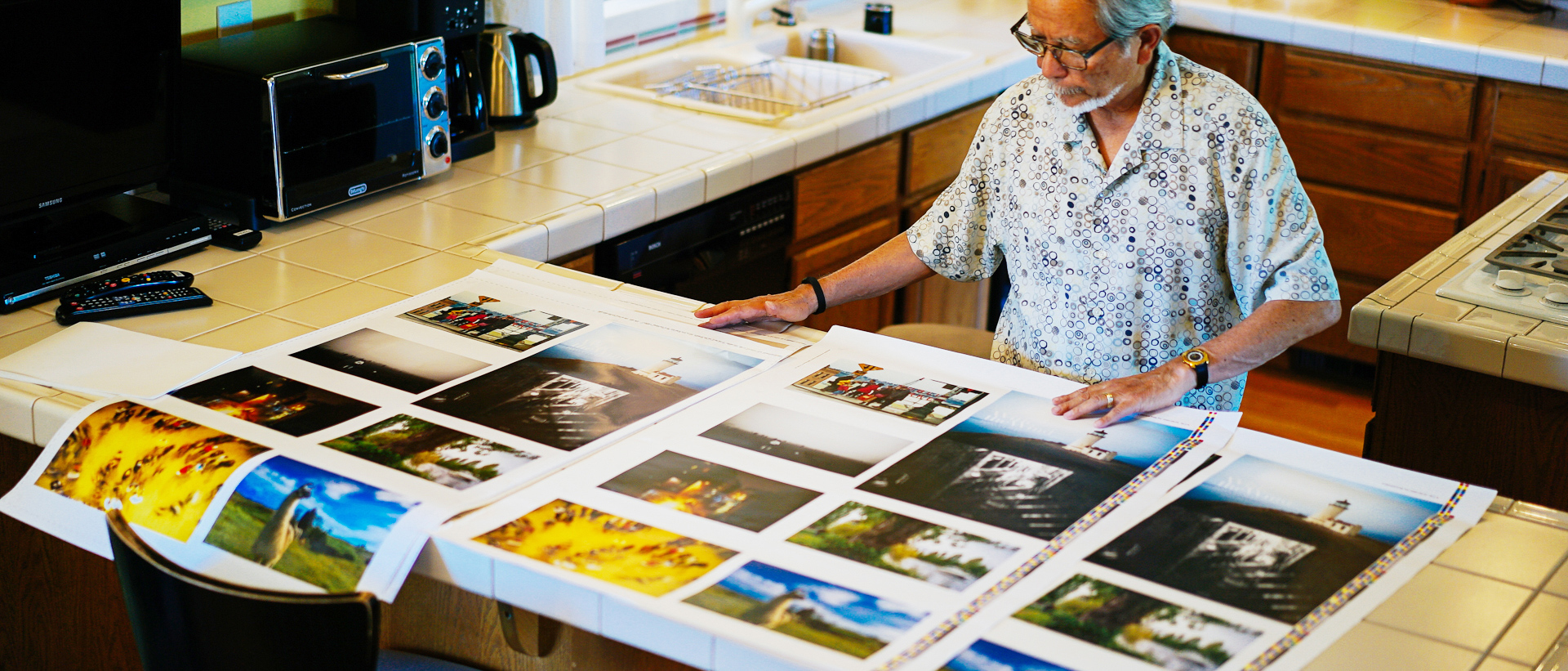
For the color proofs on the chosen stock, we printed on two papers: a pure white and a slightly yellow-toned sheet. Scott reviewed them at once. Seeing his own photographs take physical form brought him particular joy. He struggled until the very end over the choice of paper. Within his family, Scott alone preferred the yellow-toned stock; everyone else favored pure white. The editorial team also recommended pure white. A yellow-toned sheet can have great character for an entirely monochrome book, but pure white gives color photographs cleaner, clearer color. In the end, the pure-white paper was chosen. Scott's photographs are characterized by somewhat high saturation, and he asked whether the yellow could be pushed slightly. We explained the color gamut available with ink and told him that there might be limits to how far that request could be reflected during the press run. Everything else was perfect.
本紙色校正では純白と若干黄みがかった2種類の用紙に刷りました。早速Scott氏に確認して貰います。ご自身の撮影されたカットがこうして形になっていくのを見て喜びもひとしお。用紙の選択に最後の最後まで悩んでおられました。ご家族の中で、Scott氏だけが黄みがかった用紙をチョイス。あとの皆さんは純白を推すといった模様。編集部側も純白をおすすめしました。すべてモノクロームならば、黄みがかった用紙も趣があってよいのですが、純白はやはりカラー写真の色ヌケがよいのです。用紙は最終的に純白に落ち着きました。Scott氏の写真は、少し彩度が高めなのが特長であり、イエローを若干押し気味にしたいとの要望が。インクによる色域について解説し、刷り出しの段階でそれを反映するも限界はあるかもしれないと伝えました。それ以外は完璧でした。
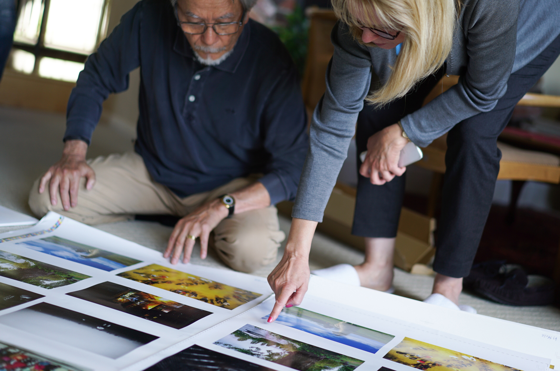
Having lived in the United States for many years, Scott is entirely comfortable speaking English in both daily life and business. To be certain, however, he asked Sheila, a longtime business partner, to translate the comments in the photobook into English. Sheila also attended the color proofing, along with Scott's wife and daughter. A love of photography and the sheer pleasure of taking pictures had moved one person to keep photographing. His passion then moved many others and was about to culminate in a single photobook. Watching the scene, we found the process deeply fascinating.
アメリカでの生活が長いScott氏は、日常はもとよりビジネスにおいても英会話になんら不安はありませんが、万全を期すために写真集の中のコメントは、長年のビジネスパートナーであるシーラさんに英訳を依頼。シーラさんも色校正に参加。その他、奥様・娘さんも。写真が好きで、なにより楽しくて撮影を重ね、その1人の情熱がたくさんの人を動かして、一冊の写真集として結実しようとしています。なんだか面白いなと、この光景を見つめていました。
⑰ Press Check
⑰刷り出し
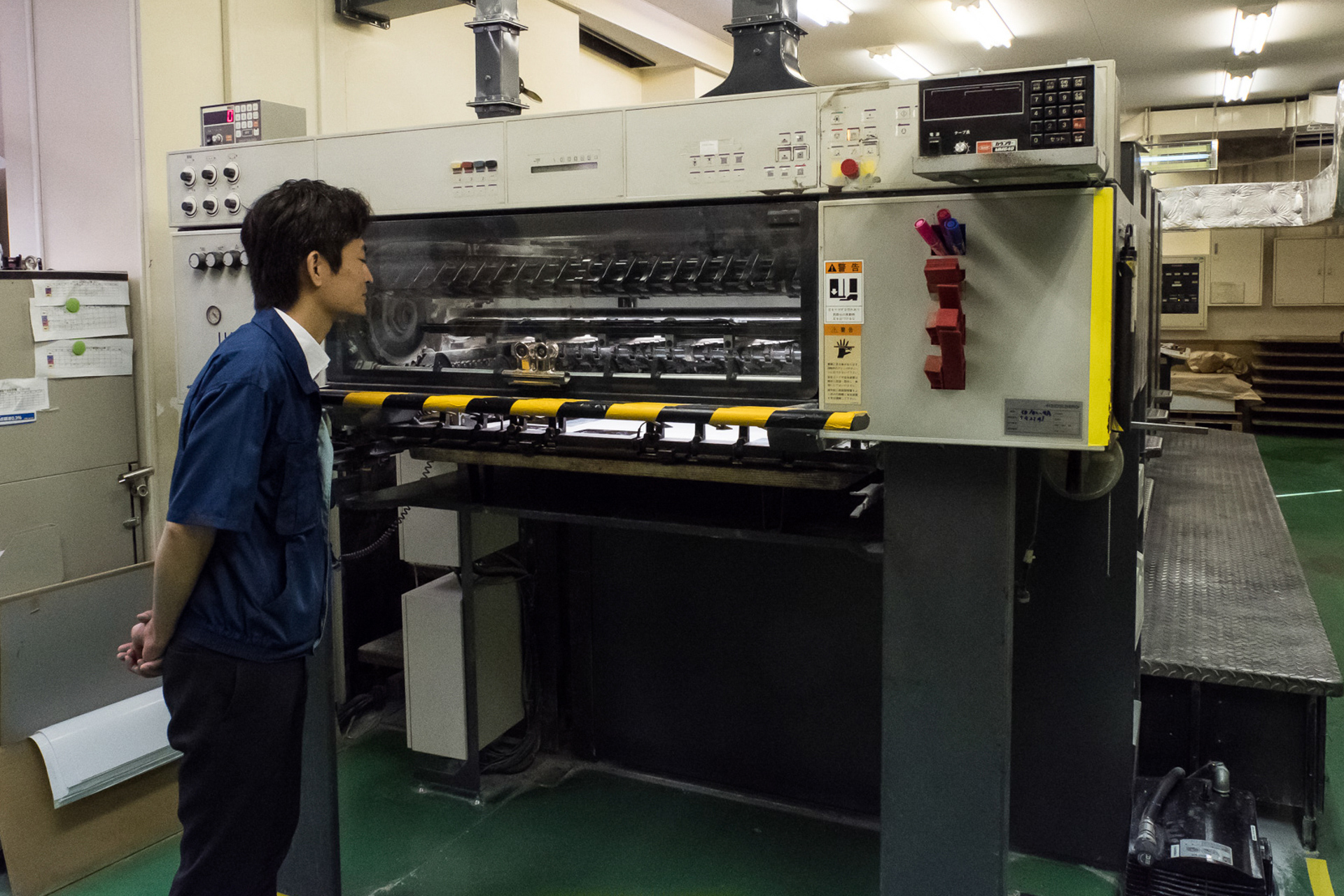
At last, the production printing began. Taking the requests from the color proof into account, the team made test prints. Printing director Noritaka Kuroda attended from image adjustment through the press check under Kumakura's direction. After the results were inspected, approval was given to proceed.
さて、いよいよ本番の印刷を迎えます。色校正での要望事項を踏まえ、テスト印刷を行います。今回、熊倉さんの指示のもと、画像調整から刷り出しまで立ち会っていただいたプリンティングディレクター黒田典孝さん。その結果をチェックした後にGOサインが出されます。
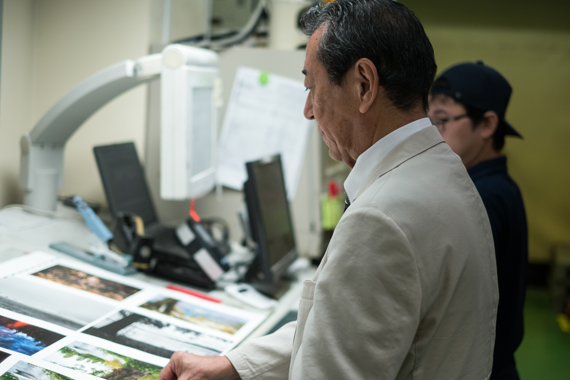
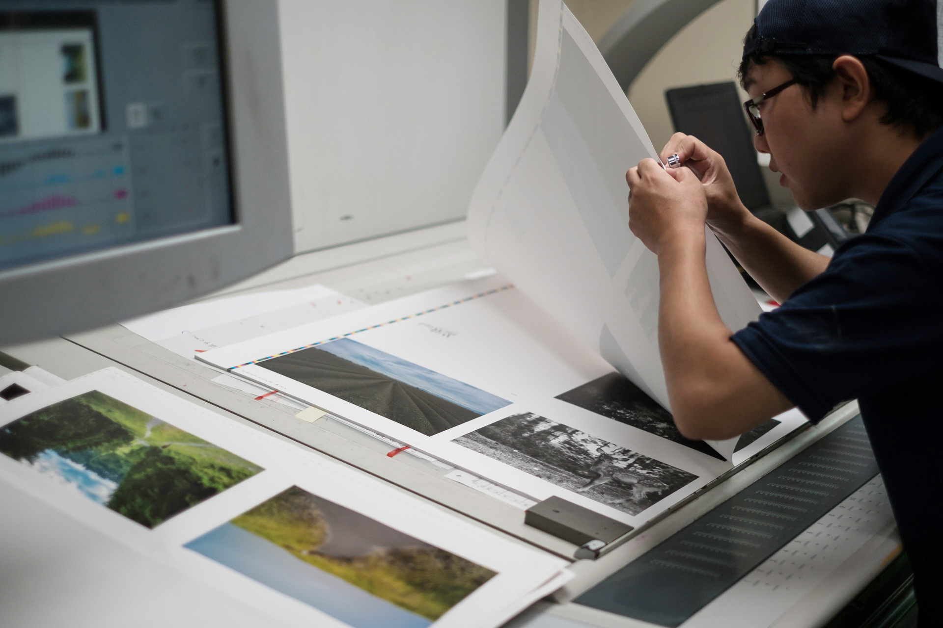
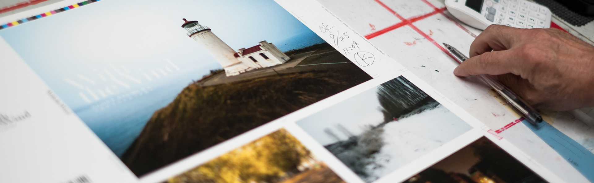
After several rounds of test printing and inspection, Kumakura finally gave his approval. Without that sign, production printing could not proceed. The press then went into full operation. After several days of drying came ⑱ binding and finally ⑲ distribution, bringing every stage to completion. When the work was over, Kumakura made a striking comment.
幾度かテストプリントとチェックを繰り返し、ようやく熊倉さんのOKサインが出ました。このサインなくして、本番プリントへと駒は進められません。この後、印刷機は本番稼働。そして、数日の乾燥を経て、⑱製本を行い、ようやく⑲配本となり、全行程の終了となります。一連の作業後、熊倉さんが興味深いコメントを。
“I have never yet been satisfied with a print.”
「未だかつて、印刷に満足したことがない」
Looking back on any job afterward, he said, he always feels he could have done a little more. Acknowledging that the question might be impertinent, we said, “Does that mean that even after such a long career, printing remains fascinating to you?” The smile with which he responded stayed with us.
どんな仕事も後になって見返せば、もう少しやれた、と。失礼を承知で「それは熊倉さんがこれだけ長いキャリアを積み重ねられても、未だに印刷が面白いということではないでしょうか」と伝えると、微笑んでおられた姿が印象的でした。
The Fascination of Photography, Printing, and Making Things
写真の面白さ、印刷の面白さ、物作りの面白さ。
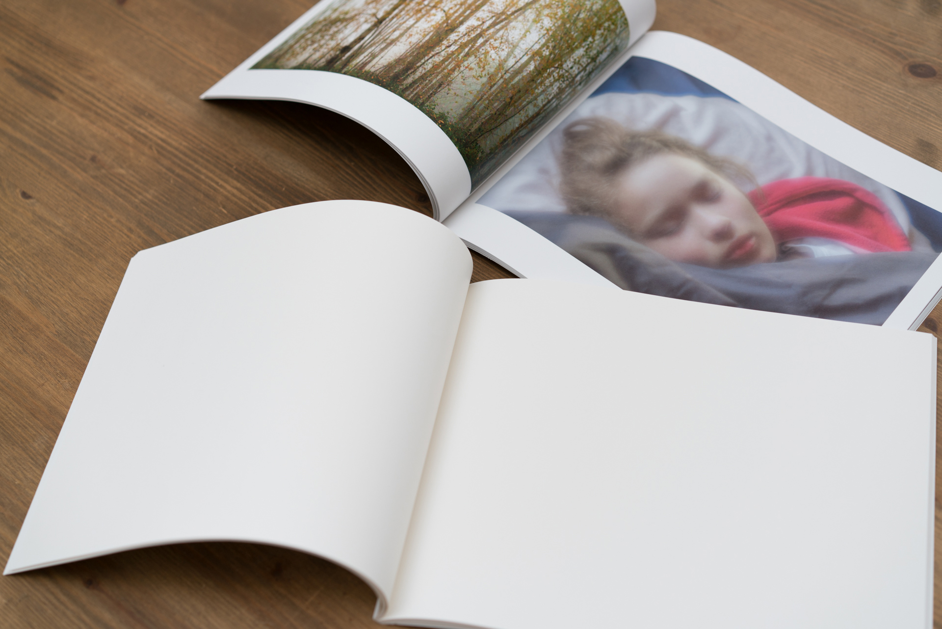
The Photo Yodobashi editorial team had previously made two books, but this was our first photobook. As fellow photographers, we could not help being inspired by the passion of someone willing to spend the time and money required to make a single volume. It reminded us again how fascinating photography is. We were also astonished by the potential of offset printing. Encountering the methods and working philosophy of a master printing director renewed our appreciation of printing and of photographic prints. Above all, the project made us want to create a photobook of our own someday.
フォトヨドバシ編集部では、これまで2冊の本を作ってきました。写真集を手がけるのは今回がはじめてでしたが、時間とお金を費やし、一冊の本を作り上げる撮り手の情熱に、同じ撮り手としてやはり感化されました。あらためて写真とは面白いなと感じさせられた次第です。またオフセット印刷のポテンシャルの高さに驚き、名プリンティングディレクターの仕事に流儀に触れ、印刷そして写真プリントの面白さを再認識させられました。何より、いつか自分も作ってみたい、そう思わされるプロジェクトでした。
Taking photographs is enjoyable in itself, but bringing them together has a special fascination. Above all, we were excited anew by the way a photograph becomes an object when it is placed on paper. Many people, like Scott, may hope to gather their work into a photobook one day. We hope this volume will offer useful inspiration, and that you will encounter the world Scott has woven.
写真を撮るだけでも楽しいことですが、それをとりまとめる面白さも格別です。なにより紙の上に写真が載ることで、写真が「物」になる面白さにあらためて興奮させられました。Scott氏と同じように、いつか写真集にまとめてみたいと考える方も多いのではないかと思います。写真集を手にして頂き、ご参考にして頂ければ幸いです。そしてScott氏が紡いだ世界に触れてみてください。
by Yodobashi Camera